Finally got all of these posts collected! Orbit did some serious research about how the wardrobe of the UF warrior woman has evolved from 2008 to 2009. The research was done by an unnamed summer intern at
Orbit. Besides the wardrobe of our leading ladies. There’s other factors Orbit looked into that made winning covers for the UF genre.

1) Abs are in: Fantasy's heroines are spending less time at the tattoo parlor and more time at the gym, as toned midriffs overtook tattoos as the favored accessory.
2) Stilettos are out: We observed a steep decline in stilettos in 2009, which just proves that fantasy readers can suspend their disbelief only so far. Romantic encounters between vampires, werewolves, elves, and humans are totally plausible, but believing that a professional demon-hunter would wear stilettos to kick demon ass isn't. In another symptom of the same trend, corsets seems to be in decline. But fear not - cleavage, even if encased in pseudo-military tactical gear, isn't going anywhere.
3) Compact Weaponry: It makes sense that our urban heroines would find it easier to maneuver through modern cities inconspicuously with small firearms and knives rather than bows and arrows strapped to their backs.
4) More ready-for-action, less ready-for-"action": Fighting stances over sexy posturing all the way.
Personally, as much as I love sexy heels, I am so glad to see them gone. I have to comment on the cleavage. If the majority of UF genre is read by woman, and is targeting woman. Do we really need all of that cleavage? Personally if I was on the run, I’d want the ladies to be safe, secure, and tucked away.

Note: Words have been generalized into one form, so for example “death” and “dead” and “deadly” all count in “death.”
First off, lets look at the content of 2009′s fantasy titles. This was a new category of inquiry for us this year and there were many surprises in store once the data was collected and analyzed. In the chart above the size of the word is in proportion to the number of books on which it appears in the title (no subtitles or series titles this time). As you can see, there are some pretty predictable words in heaviest usage: “Dragons”, “Magic”, and “Shadows” were no-brainers. However we were surprised at how high “Death” rated — was fantasy turning dark and morbid? (or more dark and more morbid than usual, at least?) But no, there was a single culprit to blame. All the Sookie Stackhouse books were re-released last year because of True Blood’s success, and that accounted for the extra “Death” usage.
Now let’s discuss the style of the 2009 titles. Even for those of you out there who can’t name at least 500 fonts on sight (that’s not even a lot for a graphic designer, says the art department) it’s pretty obvious there are some main categories of type styles. The pointy goth screams-vampire-book fonts (Mason, Democratica) are holding strong in the Urban Fantasy department, while epic fantasy books are split between a classic serif* look (Priori Serif, Jupiter) and the wanna-be-retro-futuristic look (Industria). Really, with over 10,000 quality fonts on a designer’s computer at any given moment you think we’d shake it up a bit more, but fonts are as susceptible to clichés as cover art. We are particularly looking forward to the historical style we’ve seen creep in with some of the steampunk books translate to some fresh type styles, as Boneshaker was a particular fave among the typography geeks in 2009.
*serif = has feet on the ends of the letters (Times New Roman), sans serif = no feet (Helvetica)
It’s just priceless that all of the Death’s are from the Sookie books! Though with font designs like Beautiful Creatures I’m hoping a little originality will come in.

1) We have concrete evidence that the big three fantasy cover clichés (“castles”, “glowy magic”, and “swords”) are in decline. The 50% reduction in castles can only mean one thing.
2) The number of dragons on covers held steady this year. The dragon population seems to be in perfect balance – but we can’t tell if that’s because new dragons are being born to replace old ones, or if last year’s dragons are just really healthy.
3) This year we didn’t spot a single unicorn (though it’s possible a unicorn was hidden under one of the hoods.) To all unicorn-lovers out there, don’t lose heart. Unicorns are rare – like double rainbows — so a year without them will only make their inevitable reappearance that much more magical. In the meantime, there’s always this.
We also introduced a few new categories this year.
1) Hooded figures: Not as many hooded figures as you might imagine, but early indications suggest that this category might explode in 2010.
2) Smoke/fog/mist: Smoke and mist are sometimes mistaken for “glowy magic”, so to ensure that “glowy magic” is accurately tracked, we introduced this category to weed out non-magical atmospheric disturbances.
3) Non-distressed damsels: We added this category because we were finding that most of the damsels gracing fantasy covers didn’t seem particularly distressed at all, and we wanted to show that. But “damsel” is too old-fashioned a term to contain the multitude of women that dominate fantasy covers. So next year we expect to retire the whole “damsel” category and replace it with categories that reflect the rise of the urban fantasy heroines – who were so numerous, various, and bad-ass we had to give them their own chart (coming later this week.)
4) Zeppelins and Dirigibles: We added this category to track the rise of steampunk and Victorian fantasy. We briefly considered “brass-goggles” and “gears” but airships seemed to be the most reliable indicators of this trend. Plus, they can be spotted at a great distance.
Gosh these guys are witty! Thank goodness that damsel will soon be retired.

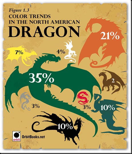
Green dragons featured prominently on fantasy covers this year — 35% of the dragons spotted wore dazzling shades of moss and emerald. Close behind were orange/rust colored dragons. Although we have no actual proof of this, our best scientific hypothesis is that dragons, being just a fantastical mashup of a lizard and a dinosaur, tend to most frequently follow actual reptilian coloring… BORING. We were happy to see some white, red, and black dragon activity, but one question: Where are all the purple dragons?
While the moods of the dragons were difficult to ascertain, we did notice that 15% of dragons were either giving humans a ride to their next exotic locale or associating with them in some other friendly manner. Good news we think.
I’ve always loved dragons on covers! Now they come in my favorite color, green. I have to ask, were there ever any purple dragons??


5 comments:
i'm glad stilletos are out!!! and glad werewolve boyfriends are in :)
That was neat. I never really thought about stuff like that.
Carrie at in the Hammock Blog: He-he. Glad were boys are in too.
Danielle@Rmance Book Junkies: I guess I just love breaking down covers, huge cover lover here. I can't wait to see what Orbit comes up with next year.
I just found this in your sidebar. What an excellent, interesting, thought provoking and not to mention fun post!
Glad you liked this one!!! It was really fun posting it!
Post a Comment