Cover art is found from Wicked Scribes, ATUF, Goodreads, social networks, and other sources.
***All cover art may not be final.***
I’m a little short on time
Call Me Grim by Elizabeth Holloway
| Previous book(s) in series: |
| Goodreads | Amazon |
 | Series: ? Add it: Goodreads | Amazon Genre: Paranormal Young Adult Shera’s thoughts: Eh. Girl with a hood and a “magical” overlay. Been there done that, bored. Plus, if it wasn’t for the title readers probably don’t know it’s paranormal. Or more, maybe she’s just a grim girl. |
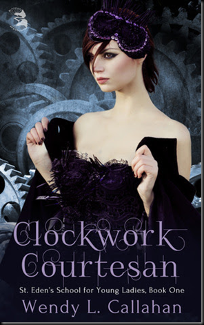
Clockwork Courtesan by Wendy L. Callahan
| Previous book(s) in series: |
| Goodreads | Amazon |
 | Series: N/A Add it: Goodreads | Amazon Genre: Steampunk Young Adult Shera’s thoughts: Um . . . is she stripping? And I think those are supposed to be goggles. But it looks like someone took some of those sleeping masks and badly photoshopped blinged them. The gears in the back look kind of cool. Really bad photo shopping. At least that font always looks cool. |
Crushed by Eliza Crewe
| Previous book(s) in series: |
 | Series: Soul Eater, book 1 Add it: Goodreads | Amazon Genre: Paranormal YA Shera’s thoughts: I like it. Inanimate objects are sometimes hard to sell on covers. But I liked the previous one and the magical skull look is fun. Even the wings. |
Double Hexed by Jennifer Ashley
| Previous book(s) in series: |
 | Series: Stormwalker, book 2.5 Add it: Goodreads | Amazon Genre: Urban Fantasy Shera’s thoughts: No and no. |
Falling Sky by Rajan Khanna
| Previous book(s) in series: |
| Goodreads | Amazon |
 | Series: N/A Add it: Goodreads | Amazon Genre: Steampunk Shera’s thoughts: It looks more dystopian then steampunk. Love the grit! The guy looks awesome. This is how I like my men to look on their covers. Sometime understated is sexy. (Note the goggles, that’s the way they’re supposed to look.) |
Incarnate by Anton Strout
| Previous book(s) in series: |
 | Series: The Spellmason Chronicles, book 3 Add it: Goodreads | Amazon Genre: Urban Fantasy Shera’s thoughts: OK, cool. And I love that despite the fact that the book covers are doing the “color dance” it doesn’t look tacky. Oh, and what’s with all the fly gargoyles in the back? Crap, I need to read book two. |


3 comments:
Great covers!
Great covers!
Thannks!
Post a Comment