Cover art is found from Wicked Scribes, ATUF, Goodreads, social networks, and other sources.
***All cover art may not be final.***
Ah, the end of the week! Time to catch up on some shows. I know a lot of other fellow book worms happen to be TV/Movie addicts. Do you guys have issues balancing both you book and TV/Movie addictions? Because I know I do.
Now let’s look at some covers!
The Void by J.D. Horn
| Previous book(s) in series: |
 | Series: Witching Savannah, book 3 Add it: Goodreads | Amazon Genre: Urban Fantasy Shera’s thoughts: Ah!!! I love the art for this series so much. Just when I think that the previous cover was the best, boom another beautiful cover. The Typography, the swirl around the typography. Ah! Just Everything about this cover. Look at how the author’s name is arched over the title. Not over powering it, and blending into the storm. That’s how you do it! |
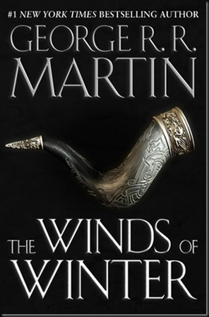
The Winds of Winter by George R. R. Martin
| Previous book(s) in series: |
 | Series: Song of Ice and Fire, book 6 Add it: Goodreads | Amazon Genre: High Fantasy Shera’s thoughts: This cover is not official. But this is a clear example of how not to do inanimate objects on covers. |
Those Above by Daniel Polansky
| Previous book(s) in series: |
| Goodreads | Amazon |
 | Series: The Empty Throne, book 1 Add it: Goodreads | Amazon Genre: High Fantasy Shera’s thoughts: Oooooo, what a cool way of mixing up the “fire and ice” theme of fantasy with a sword. Cool! Oh, and love how the sword is the “O” in Above. Groovy. |
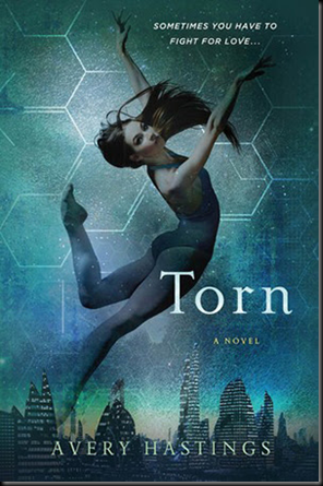
Torn by Avery Hastings
| Previous book(s) in series: |
 | Series: The Feuds, book 2 Add it: Goodreads | Amazon Genre: Young Adult Sci-Fi/Dystopian Shera’s thoughts: These covers just speak to the ballerina in me. Isn’t it amazing that some octagons artistically placed scream Science Fiction. |
Touch by Natalia Jaster
| Previous book(s) in series: |
| Goodreads | Amazon |
 | Series: N/A Add it: Goodreads | Amazon Genre: Young Adult Fantasy Shera’s thoughts: The simplicity of the cover is pure perfection. The art style to the typography is wonderful. My heart soars. Yes, less is more. |
Trailer Park Fae by Lilith Saintcrow
| Previous book(s) in series: |
| Goodreads | Amazon |
 | Series: Gallow and Ragged, book 1 Add it: Goodreads | Amazon Genre: Urban Fantasy Shera’s thoughts: This cover has been out for a while, but it is so badass I need to talk about it. I love how the tip of the spear covers the “N” in the authors name. The cover is so gritty! Reminds me of the White Trash Zombie covers. Oh, and it’s exciting the prospect of another male lead in Urban Fantasy. |
Velvet by Temple West
| Previous book(s) in series: |
| Goodreads | Amazon |
 | Series: N/A Add it: Goodreads | Amazon Genre: Paranormal Young Adult Shera’s thoughts: You know it. The typography has stolen my heart. It’s so gorgeous that the Velvet is twining around her arm. |
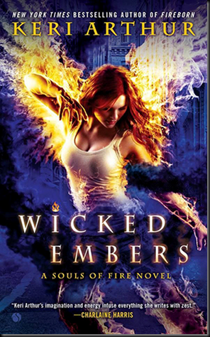
Wicked Embers by Keri Arthur
| Previous book(s) in series: |
 | Series: Souls of Fire, book 2 Add it: Goodreads | Amazon Genre: Urban Fantasy Shera’s thoughts: Another older release. Again I adore it! The last cover was awesome, this one is even better! Way to step up their game, and to make fire original. Looking forward to the next cover. |
Witches with the Enemy by Barb Hendee
| Previous book(s) in series: |
 | Series: The Mist-Torn Witches, book 3 Add it: Goodreads | Amazon Genre: High Fantasy Shera’s thoughts: Cool! But it makes me a little sad that actual drawn covers are a thing of the past. At least it seems that way. Especially for high fantasy, a genre that used to only have cool artsy covers. Still fun, matches the covers. I adore having to badass woman on the covers. |


No comments:
Post a Comment