
Cover art is found from Wicked Scribes, ATUF, Goodreads, social networks, and other sources.
***All cover art may not be final.***
Really had to hunt and peck for covers this week. However, I found some gems! Especially for certain Jay Kristoff book . . .
A History of Glitter and Blood by Hannah Moskowitz
| Previous book(s) in series: |
| Goodreads | Amazon |
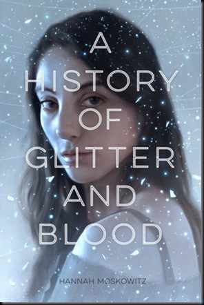 | Series: N/A Add it: Goodreads | Amazon Genre: Paranormal Young Adult Shera’s thoughts: Cool cover. No blood, but the glitter is pretty nifty. Yeah, I can see this as a fairy book. Plus, the person on the cover doesn’t look warped or weird. |
Ash & Bramble by Sarah Prineas
| Previous book(s) in series: |
| Goodreads | Amazon |
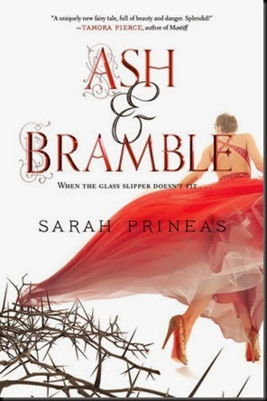 | Series: N/A Add it: Goodreads | Amazon Genre: Young Adult Fantasy Shera’s thoughts: The thorns speak of fairytale, but the style of the lady screams . . . contemporary. But she matches the thorns. I feel torn. I like what they’re trying to do, but it doesn’t work well for me. |
Becoming Darkness by Lindsay Francis Brambles
| Previous book(s) in series: |
| Goodreads | Amazon |
 | Series: N/A Add it: Goodreads | Amazon Genre: Young Adult Dystopian Shera’s thoughts: Ooooooooo. I totally see what they’re trying to do with that strip of red. Because they definitely can’t go full blown swastika. I like it. It ties in with the alternative history. Or, maybe I’m putting too much thought into it. |
Burned by Darkness by Alexandra Ivy
| Previous book(s) in series: |
| Goodreads | Amazon |
 | Series: Dragons of Eternity, book 1 Add it: Goodreads | Amazon Genre: Paranormal Romance Shera’s thoughts: Well it’s not bad. Not great. For a self pub cover is definitely pretty good. It looks like a PNR cover and the dragon clues readers in. Awesome. |
Conspiracy of Angels by Michelle Belanger
| Previous book(s) in series: |
| Goodreads | Amazon |
 | Series: Shadowside, book 1 Add it: Goodreads | Amazon Genre: Urban Fantasy Shera’s thoughts: An adult Angel book? This excites me! Though I feel like the cover is trying to trick readers. Besides glowing light there’s nothing to indicate that it’s an Angel book on the cover. It’s in the title I know, but I do think it’s a smart move. Readers either love or hate angel books by now. I’m hoping this is really a Urban Fantasy. Love the cover. |
Dawn of the Flame Sea by Jean Johnson
| Previous book(s) in series: |
| Goodreads | Amazon |
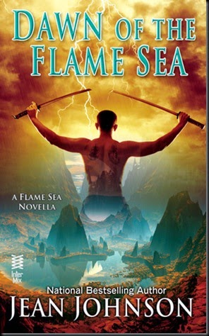 | Series: Flame of Seas, book 1 Add it: Goodreads | Amazon Genre: Paranormal Romance (Romantic Fantasy) Shera’s thoughts: OK, I like what they were going for. But the longer I stare at it it looks so tacky. Hmmm. |
Half a War by Joe Abercrombie
| Previous book(s) in series: |
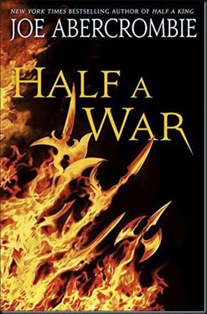 | Series: Shattered Sea, book 3 Add it: Goodreads | Amazon Genre: young Adult Fantasy Shera’s thoughts: Yes! Yes! Yes! Yes! The weapons coming out of the flames is perfection! Way to keep every cover so clever and amazing. Bravo! Bravo! |
Illuminae by Amie Kaufman and jay Kristoff
| Previous book(s) in series: |
| Goodreads | Amazon |
 | Series: The Illuminae Files, book 1 Add it: Goodreads | Amazon Genre: Young Adult Science Fiction Shera’s thoughts: Hmmm. Both authors have such amazing covers for their other books. I was expecting more. (And it doesn’t say anything about this not being the official cover.) But I really do like it. What an interesting color choice. I love the clouds and stars. Plus all the type being “scraped” out of the sky is so cool. Love it! |
Sweep in Peace by Ilona Andrews
| Previous book(s) in series: |
 | Series: Innkeeper Chronicles, book 2 Add it: Goodreads | Amazon Genre: Urban Fantasy (Sci-Fi) Shera’s thoughts: (Still no official release date, just “2015”. Gosh I want this so bad!) Ahhhh! Love it!!! What a different look from the last cover. But it still fits! I adore this one! It’s so illuminating! (Crap I’m gonna have to cave and read it online.) |
The Killing Jar by Jennifer Bosworth
| Previous book(s) in series: |
| Goodreads | Amazon |
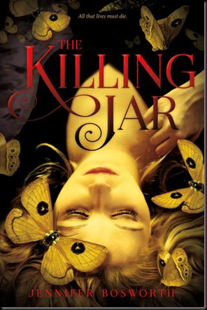 | Series: N/A Add it: Goodreads | Amazon Genre: Young Adult Dystopian Shera’s thoughts: Not sure if this is Paranormal or Dystopian. But it could fit either. Love that these are moths on the cover! They’re so simple, but beautiful! Overall this cover enchants me and I love the typography! Well done! Though I’m wondering what’s going on with her hand and hair? |
The Geomancer by Clay Griffith & Susan Griffith
| Previous book(s) in series: |
 | Series: Vampire Empire, book 4 Add it: Goodreads | Amazon Genre: Steampunk Shera’s thoughts: Another solid cover! Love it! Though I had no idea that this series was going past book 3! Last I heard it was the final one. So when I saw the “A Gareth and Adele Novel” on there I thought maybe they were new characters telling the story, but still in the Vampire Empire verse. (Yeah, I haven’t read them yet. Gareth and Adele are the leads.) I hate it when a series tries to update it’s name midway. Not sure if they’re trying to change it. But adding that extra bit seems silly and makes the cover more cluttered. |


3 comments:
Hi, Shera,
I'm Lindsay Brambles, the author of BECOMING DARKNESS, the novel you feature in your list of coveted covers. Just wanted to say I enjoyed looking over your site and reading your insights on the various covers -- particularly the one that graces my book (which I'm happy to see grabbed your attention). I can't take any credit for it, of course -- except to say that my story inspired the excellent design team at Switch Press to create something that perfectly embodies the story.
Personally, I have loved the cover since I saw the first mock-up. I especially like the little touches, like the German inscription on the model's lower lip that has particular bearing on the story. In fact, there's a lot of symbolism (as I see it) built into the cover, from the somewhat gothic feel, to the red stripe (which I agree with you evokes the Nazi flag as well as representing blood), to the clashing fonts that speak to the dichotomy of the world in which Sophie Harkness lives.
The spine and back cover do a great job of complementing the front cover, and all-in-all I think the whole package does an amazing job of conveying a sense of mystery and drawing potential readers in. It speaks on many levels, without giving away too much. And I think it's subject to interpretation, which a good work of art should be.
Anyway, just thought I'd pass along my observations. I'm keeping my fingers crossed that when the book is released in October the cover will attract readers' attention as it has yours and at least get them to take a look at what the book is about.
All the best, and keep up the good work!
Lindsay Brambles
Love your thoughts on the cover! It's always fun to see what authors think of the covers for their own books.
I hadn't even noticed the writing on the lip! Sometimes I miss cool things like that when I'm putting these posts together. Glad you pointed it out.
And I had to take another hard look at your cover after your comment.
I know I'm looking forward to this one in October.
I always wondered what it would be like to be an author and find that you absolutely hated the cover the publishing house's design team did. Fortunately, I haven't discovered that yet, but I have to admit that when I was waiting to see what the cover would look like, I was a little anxious. As an artist myself, I didn't want it to be too far from what I'd envisioned. The designer did take a look at a painting I'd done of Sophie (the main character) and used this as a reference for finding the image of the model that was used. And in the end, I think I can honestly say it's a good match.
What I really like is the tone the cover captures, that air of the enigmatic and mysterious, with a dash of the gothic and the romantic. The book is a mash-up of genres and I think the cover does a good job of reflecting that.
Anyway, I hope come October you'll get a chance to see how well the cover suits the story.
All the best!
Warmest regards,
Lindsay
Post a Comment