Cover art is found from Goodreads, Wicked Scribes, ATUF, social networks, and other sources.
***All cover art may not be final.***
I've been too lazy to fix my header. Apparently google has decided you can't get the link for pictures you've already uploaded. *sighs* It it works perfectly break it. That seems to be google, and internet providers (data caps anyone) latest motto.
Hopefully I'll get motivated soon. Now let's look at some pretty covers.
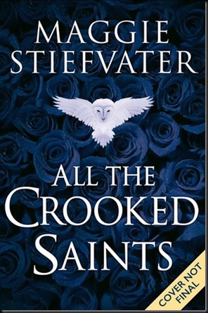
All the Crooked Saints by Maggie Stiefvater
| Previous book(s) in series: |
| Goodreads | Amazon |
 | Series: N/A Add it: Goodreads | Amazon Genre: N/A Shera’s thoughts: Okay, so this is a placement holder until the real cover comes. Still I'm impressed by how much thought goes into them. Sometimes I feel like more thought goes into them than some other poor covers ever get. My favorite thing about this is the white owl. It's perfect. Pumps me up for the real cover. |
Before She Ignites by Jodi Meadows
| Previous book(s) in series: |
| Goodreads | Amazon |
 | Series: Fallen Isles Trilogy, book 1 Add it: Goodreads | Amazon Genre: Young Adult High Fantasy Shera’s thoughts: Okay, so this might count as a pretty dress cover, however I love it! Espeically the flowered head dress. I like the concept of the serpent . . . but is that supposed to be the dragon? Eeks. It gets a 0 for dragon, but all together it looks lovely! |
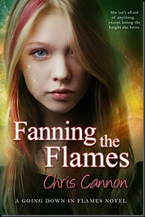
Fanning the Flames by Chris Cannon
| Previous book(s) in series: |
 | Series: Going Down if Flames, book 4 Add it: Goodreads | Amazon Genre: Paranormal Young Adult Shera’s thoughts: Ah, so color streaks this time and not so much magical hair! I bet it's because she's not a full blooded dragon? Oh, I'm just speculating. I actually haven't read the books. While I'm not a fan of the covers I do like the consistency for the series. |
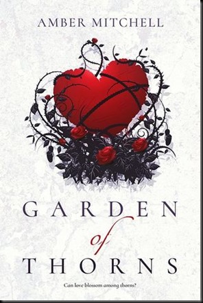
Garden of Thorns by Amber Mitchell
| Previous book(s) in series: |
| Goodreads | Amazon |
 | Series: N/A Add it: Goodreads | Amazon Genre: Young Adult Fantasy Shera’s thoughts: This is very beautiful, though if I star too long there's something off about the big heart. Love the look of the thorns and the roses, and the placement helps to make the title get more attention. However, I don't like the "of" in the title. I get what they were trying to do, but I'd pick a different script font. |
Into the Bright Unknown by Rae Carson
| Previous book(s) in series: |
 | Series: Gold Seer Trilogy, book 3 Add it: Goodreads | Amazon Genre: Young Adult Fantasy Shera’s thoughts: This is a bit more darker colors on the covers so it doesn't quite have the pop that I want. Especially the gold. Still a very lovely cover and I like seeing more mountains/scenery as part of the theme. Just wish the title could pop more. |
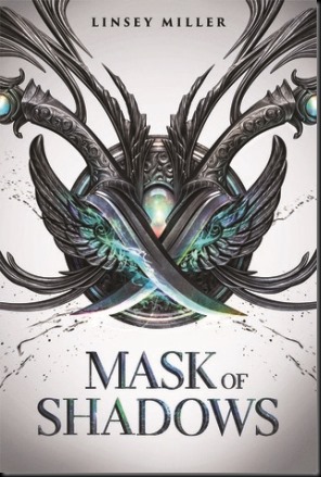
Mask of Shadows by Linsey Miller
| Previous book(s) in series: |
| Goodreads | Amazon |
 | Series: untitled, book 1 Add it: Goodreads | Amazon Genre: Young Adult Fantasy Shera’s thoughts: Love! Love! LOVE! This cover. I'm not sure what it's supposed to be, but I like it. It's kind of a mix of daggers and a pendant. Or dagger wings mesh up! Either way very cool. |


No comments:
Post a Comment