The beautiful covers just keep rolling out! If only spring would come with them.
Beautiful Chaos by Kami Garcia
& Margaret Stohl
Source: goodreads
Shera’s Thoughts: Even though I don’t like the books the covers for this series always captivates me. This one fails. The background gate looks really amazing, but what were they thinking with that color. It’s puke yellow, or as I like to call it “baby chicken dung.”
Author’s Thoughts:
"When you read the book, I think [the title] will be really obvious," she said. "Without a spoiler, for those who read 'Beautiful Darkness,' they know that there were a lot of actions at the end of the book, a lot of decisions that were made that yield serious consequences and some of those consequences are the essence of chaos to us." –Kami Garcia & Margaret Stohl
| Previous Books: |
Lost in Time by Melissa De La
Cruz
Source: goodreads
Shera’s Thoughts: This has to be the most beautiful cover I’ve seen with a feather on it. It makes my toes curl with how understated sexy it is. Plus I love the Egyptian outline at the bottom. It’s just like the first book with it’s city outline at the bottom—something I loved on the first cover. Plus, I am so happy with her shade of lipstick. I know it’s a weird thing to pick up on, but a lot of series have been featuring fire engine red for their lady’s lips.
Author’s Thoughts:
“Gorgeous gorgeous gorgeous. DYING over here.” – Melissa de la Cruz
| Previous Books: |
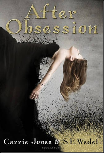
After Obsession by Carrie Jones
& SE Wedel
Source: ATUF
Shera’s Thoughts: Put this book in my goodreads to read a while ago, and yet I never thought of sharing the cover.
It’s stunning. The black dress breaking up is beautiful, leaving readers with a mystery to solve. Is it there to hint what the book might be about, or is it simply there for the stunning effect. Though, if I look at it for a really long time I start seeing the swarm of locus from Hildago. (Does the title font remind anyone else of Jone’s Pixie series?)
Author’s Thoughts: N/A
| Previous Books: |
| N/A |
Chosen by Fate by Virna DePaul
Source: ATUF
Shera’s Thoughts: It’s a classic UF pose and format. Girl clad in tight leather and a revealing under tank, plus that grungy urban city scene. It works nicely for the series and links it well to the previous book. Also, I love how the font matches the shirt color again. What can I say I’m a coordinating girl!
Author’s Thoughts:
Graced by the cover Gods!! Check out the cover of Book 2 of the Para-Ops Novels!!! Can't gush enough about Berkley's art department!! – Virna DePaul
| Previous Books: |
 |
The Pledge by Kimberly Derting
Source: ATUF
Shera’s Thoughts: Oh, baby! Oh, baby! Now that is what I’m talking about. The cover model’s expression is perfect. She’s haunted, almost an expression as if she’s not all there. The effect of the background and her hood/cap/fishnet thing blending in together makes her white skin slap you to attention with its contrast. The Pledge lettering that has what looks like a screening/watermark effect is also really pleasing to the total look of the cover. Truly a unique design.
Author’s Thoughts:
“ZOMG, what do you think?!?!? Do you love it as much as I do??? I have to say, I have hearts floating out of my eyes…” –Kimberly Derting
| Previous Books: |
| N/A |
Succubus Revealed by Richelle Mead
Source: ATUF
Shera’s Thoughts: Oh, god. Gauge my eyes out now. Not only is Georgina ugly on this cover, but she’s bright and ugly. Oh, and look that nasty fire engine red catastrophe I hate to love to rant about. I worship this series, but why does it have to suffer from some of the worst covers out there. I’m happy she doesn’t look as creepy as the last cover. That was Mime power, all the way.
Author’s Thoughts:
“After some fighting with my scanner (whose problems are 95% the result of my laziness to properly install some software), I’m very happy to be able to give you the cover for Succubus Revealed” – Richelle Mead
| Previous Books: |
Cold Kiss by Amy Garvey
Source: ATUF
Shera’s Thoughts: This cover brings up mixed feelings for me. I love the idea of it, but it needs to be darker and a bit more contrast. I want the frost to jump out, like she’s kissing it on glass. The idea is great, but I think the execution could use some more work. The custom font is definitely working.
Author’s Thoughts: N/A
| Previous Books: |
| N/A |
Frost by Marianna Baer
Source: N/A
Shera’s Thoughts: Um, wow! This cover is easily the best. The monotone colors. I love how the house is on top of her, but she’s clearly in the forefront. Her pose is so unique, I love unique cover model poses. Don’t know what this book is about, but I assure you I’m finding out and it’s count down time tell it’s released.
Author’s Thoughts: N/A
| Previous Books: |
| N/A |
Enthralled (Anthology)
Source: ATUF
Shera’s Thoughts: It seems like more and more anthologies are getting the great covers instead of the regular books in UF. The color tone for this cover is perfect. The never ending road and trees lining it are perfect photography. The girl looks cool, but it looks to photoshopped. They needed to do some additional editing to make her fit in perfectly. The magical mist might be too bright.
Author’s Thoughts: N/A
| Previous Books: |
| N/A |


2 comments:
Some great covers here!!
Melissa De La Cruz always has BEAUTIFUL covers!
Yes, she always has fantastic covers. Each time I think, this is the best one a better one comes out!
Post a Comment