Big heads on YA books just seem to be coming more and more popular of late. See for yourself.
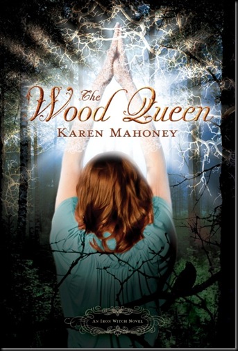
The Wood Queen by Karen
Mahoney
Source: Karen Mahoney
Shera’s Thoughts: This cover is definitely more busy then the first one, but it definitely seems to fit what Mahoney is saying. The first cover is shy, this one is clearly an awakening. Plus I love the branches!!
Author’s Thoughts:
Donna is growing in confidence and power, and I love that we can see an actual moment from The Wood Queen right here. I am also happy to see a cover with action - something happening - rather than a static pose. (Of course those covers are lovely, but for TWQ this one is perfect.)
| Previous Books: |
 |
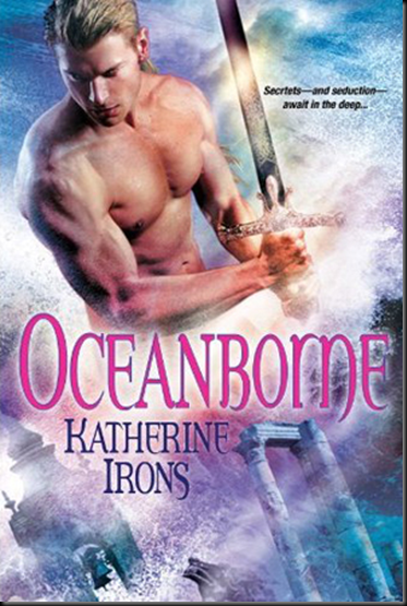
Oceanborne by Katherine Irons
Source: Wicked Scribes
Shera’s Thoughts: All right I complain all the time about naked chests on PNR covers. This time it’s more then a naked chest. The artwork has a painted feel to it, and everything blends in so nicely. Two thumbs up!
Author’s Thoughts: N/A
| Previous Books: |
 |
The Blood Coven Vampires:
Volume 1 by Mari Mancusi
Source: Mari Mancusi
Shera’s Thoughts: Not a huge fan of this series covers, but this is even worse. Big head, with cool flowers that just don’t blend in well. This Volume contains Boys that Bite and Girls That Growl.
Author’s Thoughts:
“I'm so excited to be able to share this cover with you at last!”
| Previous Books: |
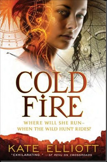
Cold Fire by Kate Elliott
Source: Wicked Scribes
Shera’s Thoughts: Love, love, love it!! The designs creeping onto the girl are just so well down, and I love the mountains/city at the bottom.
Author’s Thoughts: N/A
| Previous Books: |
 |
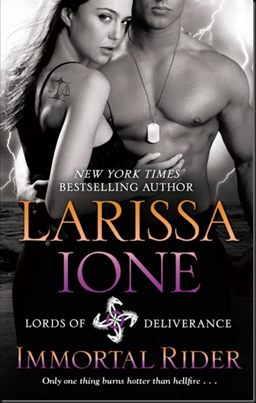
Immortal Rider by Larissa Ione
Source: Wicked Scribes
Shera’s Thoughts: Ione has a point the font colors are awesome!! Especially against the cool black and white. Having couples on the cover is hard to do without resorting to sex scenes. This one does well being sexy, but without over doing it.
Author’s Thoughts:
I have a new cover! I'm so excited — I LOVE this cover. It fits Limos so well, right down to the font colors.
| Previous Books: |
 |
Shattered Dreams by Ellie James
Source: ATUF
Shera’s Thoughts: My first thoughts were that I really liked this cover. It’s pretty and the necklace look fascinates me—going back to The Dark Powers trilogy. However if you keep staring, where is her shoulder??? Maybe it’s hidden by her fair, which is hidden by her weird starry blah? It irks me.
Author’s Thoughts: N/A
| Previous Books: |
| N/A |
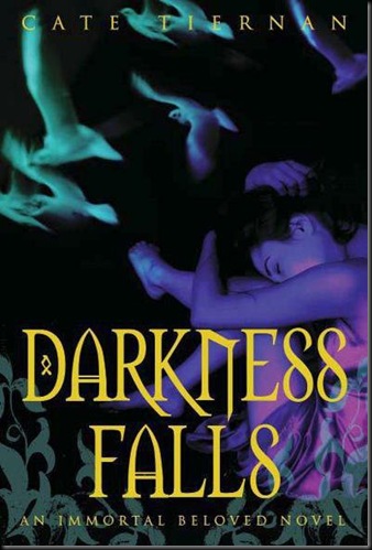
Darkness Falls by Cate Tiernan
Source: ATUF
Shera’s Thoughts: At first my eyes thought the Doves were arms, but now all I can see is the Doves. Doves, what a cool choice usually for these kinds of books they go with bats or owls. Dare to be different. Plus I really like the weird gradient type color effect. Very in keeping with book one.
Author’s Thoughts: N/A
| Previous Books: |
 |
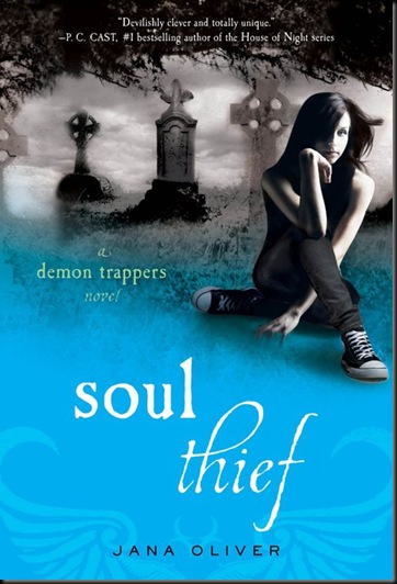
Soul Thief by Jane Oliver
Source: ATUF
Shera’s Thoughts: It can not be said enough how much I loved the first cover, and it brings a lot of the goodness to the second cover. The charcoal drawing blends in perfectly with the blue, and the wings are beautifully placed. The pose of the girl is ambitious, though not as cool as the first book.
Author’s Thoughts: N/A
| Previous Books: |
 |
Death Watch by Ari Berk
Source: ATUF
Shera’s Thoughts: Complex and beautiful covers are my bread and butter. However, it’s nice to see some simple work every now and again.
Author’s Thoughts: N/A
| Previous Books: |
| N/A |







2 comments:
Very nice blog. Come on over to mine as well. Love the covers as well.
Well thank you Grace! I'll be sure to stop on by.
Post a Comment