Cover art is found from Wicked Scribes, ATUF, Goodreads, social networks, and other sources.
***All cover art may not be final.***
Sometimes cover makeovers are so exciting—when a series really needs it. However, this time not so much. I loath it when new editions don’t have the same cover style. It’s like they’re preying upon crazy book nuts like me. Who simply one all of their books to match!
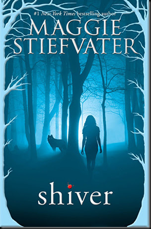
Shiver by Maggie Stiefvater
| Previous book(s) in series: |
 | Series: The Wolves of Mercy Falls, book 1 Add it: Goodreads | Amazon Genre: Paranormal Young Adult Shera’s thoughts: This new design is nice . . . but I’ve always been taken by the original design. Like how they’re still trying to incorporate the silhouettes while still adding more depth to the look. |
Linger by Maggie Stiefvater
| Previous book(s) in series: |
 | Series: The Wolves of Mercy Falls, book 2 Add it: Goodreads | Amazon Genre: Paranormal Young Adult Shera’s thoughts: Hmmmm . . . this one might be an upgrade from the original. I never really liked the girl walking away. It look awkward. |
Forever by Maggie Stiefvater
| Previous book(s) in series: |
 | Series: The Wolves of Mercy Falls, book 3 Add it: Goodreads | Amazon Genre: Paranormal Young Adult Shera’s thoughts: So they had the girl on the first one, boy next, and now it’s time for boy and girl! Looking at the older covers, I think I would like them more if they would have left the people off of them. |
Sinner by Maggie Stiefvater
| Previous book(s) in series: |
 | Series: The Wolves of Mercy Falls, book 4 Add it: Goodreads | Amazon Genre: Paranormal Young Adult Shera’s thoughts: This cover definitely screams new chapter in the series. More layers and depth. At least they’re still keeping the typography the same. |
Let me know what you think! Are the covers better then the originals? How do you like the Sinner cover?


No comments:
Post a Comment