Eek! The image isn’t quite done yet, but I couldn’t hold out on showing something!! If you can’t tell the format for sharing the covers is inspires by ATUF, so I have to send out some props.
Hit List by Laurell K. Hamilton
Source: goodreads
Shera’s Thoughts: It actually makes my want to poke out my own eyes. The color scheme is cool, but what the fudge is going on with that chick? All I can say is that this series suffer from BAD covers. First the slightly cool body shots in different colors, and weapons and cuffs objects.
Author’s Thoughts: N/A
| Previous Books: |
         No all of them here. No all of them here. |
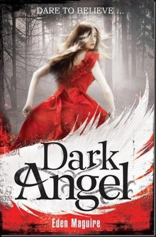
Dark Angel by Eden Massi
Source: Love Fantays Sci-Fi Novels
Shera’s Thoughts: Oooo, pretty. I love the shocking read dress and then the white wing sweeping across the cover. The misty woods just add to the affect.
Author’s Thoughts: N/A
| Previous Books: |
| N/A |
Supernaturally by Kiersten White
Source: goodreads
Shera’s Thoughts: The cover model for this series is so gorgeous, and I love the way she looks against all that read. The flowers look perfect, just like the cattails on the other cover. Plus she has another cool dress on! So shoot me, I like pretty dresses.
Author’s Thoughts:
“So much pretty. The red! And the flowers! AND THE DRESS! And that line above Evie's head that I am very, very fond of! And can I just say again how much I love the model they picked for Evie? I especially love that you can see her eyes better in this one. They are exactly how I always pictured Evie's eyes "like streams of melting snow….But just when you thought you couldn't love this amazing red cover any more, I have EVEN MORE TO LOVE! One of my favorite design aspects of my covers (aside from, well, everything) is that they wrap around so the image continues onto the back. THIS TIME WITH LIGHTNING.” – Kiersten White
| Previous Books: |
 |
So Silver Bright by Lisa Mantchey
Source: ATUF
Shera’s Thoughts: These books are the perfection of ethereal beauty and fairy mischief. Each is a treat for the eyes. I love how the fairies are always dancing about and the outfits are stunning.
Author’s Thoughts:
“Once again, Jason Chan has created something incredibly beautiful and magical that wholly captures the essence of the book. Heapings of glitter and cupcakes upon his head, as well as Jean Feiwel and the art department at Feiwel & Friends for this:”
| Previous Books: |
Jessica Rules the Dark Side
Source: goodreads
Shera’s Thoughts: The cover is so pretty, but it doesn’t fit the previous cover. OK, it does fit clearly the couple the and the dancing. It just doesn’t look modern, it looks like something for a historical. Hey, for all I know it fits the book.
Author’s Thoughts:
For those of you who've been patiently waiting, here's the cover of Jessica Rules the Dark Side! Have a great weekend, everybody!” – Beth Fantaskey (Provided by ATUF)
| Previous Books: |
 |


No comments:
Post a Comment