All covers are not final!
So Wednesday Wishes is supposed to be posted. However, there are some amazing covers that are making me just as wishful for the books. So this is kind of a Wednesday Wishes being taken over by loving cover art!
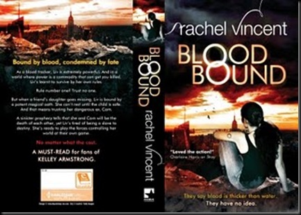
Blood Bound by Rachel Vincent
Source: Rachel Vincent's Blog
Shera’s Thoughts: It’s really had to choose favorites of the two.
USA cover has a dark and etheral feel with it’s blueish/gray tones. While the UK just burns with the rated R-ness Vincent claims lays behind the cover. Love how both covers Os are connected. In the end, the UK edition takes the prize. It’s just so BOOM. It' would stand out on a shelf, the USA just blends into the background.
Author’s Thoughts:
People have been asking for the Blood Bound cover for several months now, and today I finally get to post not just the US cover (top), but the UK cover (bottom) as well. And since I'm posting the full cover for both, you can see the differences in how the two different marketing/art departments view the book.
Blood Bound is the book I've previously described as "Romeo and Juliet meets The Godfather." It's very dark and kind of twisted. Oh, and for those who have been asking me what Liv is, she is a Tracker. Kind of like a paranormal bloodhound. She finds people who need to be found. Most of whom don't want to be found. If Blood Bound were a movie, it'd be rated R for L, V, and SC. This is NOT YA.
Blood Bound will be released simultaneously in the US and the UK on August 23, and as you can see, the art for the two versions is very different. They each also have slightly different back cover blurbs, and I find it fascinating to see which aspects different branches of the same publisher chose to highlight.
If you remember the poll held here a few weeks ago, you'll notice that the UK cover artist took note of the opinions and notes left by the readers, and I have to say, I love the coloring on this version. The reds and the golds. The interlocked rings in the title on both versions have significance in the story, as does the cityscape on the UK version. And I LOVE the tagline at the bottom of the UK version! For what it's worth, the US is marketing the series as paranormal romance and the UK is marketing it simultaneously as urban fantasy. I personally think it's somewhere in between. Liv and Cam each get their own POV, like a romance, but both of those are in first person, which is fairly common in urban fantasy. The next book in the series, Shadow Bound, will be told by a different set of characters, as is common in romance series, but all of the books are plot/worldbuilding-heavy. So I guess I'll let the readers classify the novel/series however they want, once the book is out.
| Previous Books: |
| Hot new series fools!!! |
Vampire Empire Book Two: The Rift Walker by Clay Griffith & Susan Griffith
Source: ATUF / goodreads / Clay Griffith's Blog
Shera’s Thoughts: Damn.
Wish I could just leave it at that. However I just have to comment on how much I love the sleeping beauty steam punk thing going on here. The falling roses, the motes of light, the figure of Greyfrair. This is every cover lovers wet dream.
Author’s Thoughts:
Gaze upon the cover art for Vampire Empire, Book 2! The artist, Chris McGrath, has outdone himself! We love the colors and the mood the art sets for the tone of the novel. And the figure of Greyfriar is just...well...damn.
| Previous Books: |
 |
The Real Werewives of Vampire County
Source: Wicked Scribes
Shera’s Thoughts: This is just ugly. And tacky. Ugly and tacky, my two least favorite combos to see on a cover. If the lovely Jesse Haines wasn’t in this anthology I probably wouldn’t have even bothered.
Author’s Thoughts: N/A
| Previous Books: |
| N/A |
The Hunter by Theresa Meyers
Source: Wicked Scribes
Shera’s Thoughts: This is cheesy. Yet, it’s the kind you have to respect. Though what’s up with the guys gun. (Get your minds out of the gutter.) It’s like a light saver wanna be thing.
Author’s Thoughts: N/A
| Previous Books: |
| New Series |
Siren’s Desire by Devyn Quinn
Source: Wicked Scribes
Shera’s Thoughts: So far this is my least favorite cover so far in the series. It doesn’t have the Siren feel of the first two. At least they sky is just as stunning as ever.
Author’s Thoughts:
Meanwhile, here's a look at the cover for Siren's Desire, the final book in the Dark Tides Trilogy. This is Addison's story, and I will post the back cover copy as soon as I have it:
| Previous Books: |
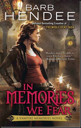
In Memories We Fear by Barb Hendee
Source: Wicked Scribes
Shera’s Thoughts: Love Big Ben in this scene. The UK has gone creepy batty. (All right cheesy.) On to other things, so happy to see that vampire flapper thing not popping up on this cover. It was so wrong . . .
Author’s Thoughts: N/A
| Previous Books: |
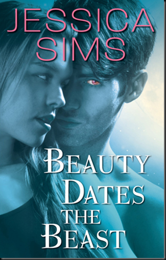
Beauty Dates the Beast by Jessica Adams
Source: Wicked Scribes
Shera’s Thoughts: Simple, yet cool. Blue covers with pink type seems to be really in. They eye color standing out is another element I’ve been seeing a lot on PNRs lately.
Author’s Thoughts: N/A
| Previous Books: |
| First in a New Series |
Devil’s Kiss by Zoe Archer
Source: Wicked Scribes
Shera’s Thoughts: Simply tasteless. Neck, chest, and flames. Never been down before, forget that it’s beyond over used. Besides after Archer’s Blades of Rose series this is like spitting in my eye. This cover does not sale this new series.
Author’s Thoughts: N/A
| The Blades of Rose: |
Shaedes of Gray
Source: Wicked Scribes
Shera’s Thoughts: Awesome!! This is spot on Urban Fantasy kick ass-ness. Another red head to join my collection. (No really do you notice how many UF heroines are red heads?) This book’s cover sold me.
Author’s Thoughts: N/A
| Previous Books: |
| First in a New Series |
The Bite Before Christmas
Source: Wicked Scribes
Shera’s Thoughts: It’s official the design teams behind anthology covers just don’t give a bats flying bug about their covers. In all honesty this probably could have been a cool cover with just the grave yard.
Author’s Thoughts: N/A
| Previous Books: |
| N/A |


![Rift Walker_thumb[3] Rift Walker_thumb[3]](https://blogger.googleusercontent.com/img/b/R29vZ2xl/AVvXsEhX5VHjdNjKxKBF861v3uUS-OWv_ol2QtL9MEZR9BlztGxaa9UwzJtuW1f9hg4K7JG2FWKlKG6oPAXuWBn_6gU-ovtOnhAVu1zz-rP-Wcd923znMLSW1RC6ruG0c8xrfXQ7V18_blyY95rz/?imgmax=800)









No comments:
Post a Comment