You’re all probably wondering why I didn’t have my regular Wednesday Wishes post yesterday—or maybe not. That’s because I’ve been working on the June Release post. They always are so hard to put together and I’ve decided to take 3 days instead of one to throw it together. Look out for a June Monthly release people!!
All cover art is not final!
Clockwork Prince by Cassandra Clare
Source: goodreads
Shera’s Thoughts: Honestly I think it’s a stunning design. However, there is just something wacked going on with this guys neck,face, and hair. It’s just terrible!! The neck seems small . . . Whatever it is exactly it ruins a perfectly wonderful cover.
Author’s Thoughts: N/A
| Previous Books: |
 |
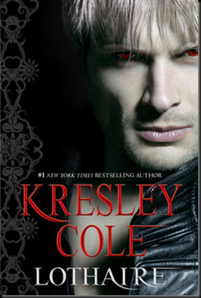
Lothaire by Kresley Cole
Source: Wicked Scribes
Shera’s Thoughts: Never thought I’d say this, but I want the naked man chest back. This cover looks like a rip off of a House of Night books, minus the cool factor. Honestly I was afraid of this with the downgrade of the name and the upgrade to hard back. Misfortune come in threes . . .
Author’s Thoughts: N/A
| Previous Books: |
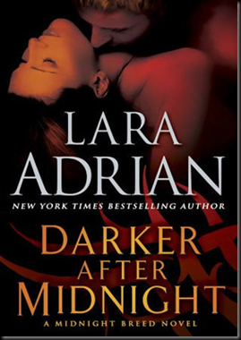
Darker After Midnight by Lara Adrian
Source: Wicked Scribes
Shera’s Thoughts: I’ve never been blown away by the covers for the Breed series. At least this latest one fits in well with the others.
Author’s Thoughts: N/A
| Previous Books: |
Devoted by Hilary Duff
Source: ATUF
Shera’s Thoughts: Been there done that!! The blue toned, head cut off, wind blown hair, and necklace has been done before—but better. Personally I like the previous cover mucho better.
Author’s Thoughts: N/A
| Previous Books: |
 |
Blood Song by Rhiannon Hart
Source: ATUF
Shera’s Thoughts: This is perfection!!! The contrast is stunning. I love how the bird and text seems to glow out of the gloom.
Author’s Thoughts:
I'm so happy with the cover and can't wait to meet it in person. – Rhiannon Hart
| Previous Books: |
| N/A |
Serpent’s Kiss by Thea Harrison
Source: N/A
Shera’s Thoughts: So much better then the last cover!! This is better then the first one as well. Sure it’s nothing mind blowing, but I like the composition. And it’s nice to see a hot man rocking an abs hugging T-shirt. Much appreciated.
Author’s Thoughts:
I’m delighted to post the gorgeous cover for SERPENT’S KISS! – Thea Harrison
| Previous Books: |
Brightest Kind of Darkness by P.T. Michelle
Source: ATUF
Shera’s Thoughts: Just when you think you’re done with the ball gown look, a cover like this pops up. Really it’s stunning. The forest scene and lighting threw the canopy is perfect. Just looking at this cover makes me smell the fall air and the tang of distant mountains. Hear those birds?
Author’s Thoughts:
I’m excited to share the cover for my YA Brightest Kind of Darkness. What do you think?
– P. T. Michelle
| Previous Books: |
| N/A |
Lightbringer by K.D. Mcentire
Source: ATUF
Shera’s Thoughts: Breaking barriers here!!! That chandelier totally stills the show. Not sure what’s going on with the girl. Is she running? Is this a Phantom of the Opera moment where she’s running from the swinging chandelier?
Author’s Thoughts: N/A
| Previous Books: |
| N/A |
No Hero by Jonathan Wood
Source: ATUF
Shera’s Thoughts: Gini Koch Kitty Kat series anyone? The art style and alien feel is a lot of like. Though Koch’s covers are cooler, this one is stunning in it’s own way.
Author’s Thoughts:
Of all the little odds and ends involved in getting No Hero from typo-riddled manuscript I banged out on the train to finished book, receiving images on the various states of the cover is still my favorite. It somehow makes everything seem more real.
– Jonathan Wood
| Previous Books: |
| N/A |













4 comments:
With the Cassandra Clare cover, I think his head looks out of alignment with his body slightly which makes his head look weird!
I really like the Blood Song cover though!
I quite like the Lothaire cover, although I am annoyed that it is coming out in hardback!
Suzanne
Yeah, I can see that about his head. I hope they fix it before the book goes out in print.
The Lothaire cover just doesn't do it for me. Specially when they change the design in the series. I like a uniform look.
Glad I'm not the only one who's not thrilled about the hard back copy.
Great covers! I just seen The Clockwork Prince one at a Simon and Schuster party in New York for bloggers and there is an awesome inside color page as well that is so exciting!
Now I'm overly excited to see what the inside cover looks like!
Post a Comment