Cover art is found from Goodreads, Wicked Scribes, ATUF, social networks, and other sources.
***All cover art may not be final.***
Decided to skip the Wednesday Wishes post and concentrate on the cover makeover for The Winner's Trilogy. A series that always makes my wish lists, TBR pile, and I get tons of recommendations for.
It's one of my group reads this month, and a GR friend pointed out that the series is already getting a cover makeover! What?
Let's take a look.
The Winner's Curse
(The Winner's Trilogy, book 1) by Marie Rutkoski
| Old Cover: | New Cover: |
 |  |
Honestly I do think the original cover is lovely, but you can barely see the daggers and I don't like this whole faint/swooning thing they've got going on. I do see she's holding the R very cool.
The new cover you can clearly see the daggers and she looks fierce! I haven't read this series yet? Why because I'm thinking it's another annoying "dress" YA crazed series. After seeing the new cover you bet your sweet bookness I'm gonna read it this month!
The Winner's Crime
(The Winner's Trilogy, book 2) by Marie Rutkoski
| Old Cover: | New Cover: |
 |  |
Let's be honest they're both dress covers. Sure the new one has the dramatic badass cloak. But in this case the sword/dagger is better showed off in the old cover. I love how the sword goes through the R and becomes the I. Awesome design. I'll give the design team props for trying to make the dagger go through the E, but it just looks awkward.
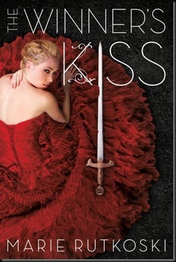
The Winner's Kiss
(The Winner's Trilogy, book 3) by Marie Rutkoski
| Old Cover: | New Cover: |
 |  |
Sweet covers! I just love how the sword is again part of the title of the book on the old cover. The simple and dramatic look is perfect.
I like the new cover, but the longer I stare at it it's off. I think the background is too busy. Not to mention the knife and dagger are to busy in the title. A title that is already having a hard time standing out on the cover.
Overall I like that they're trying to resell and package the series with the girl looking strong. You know a badass female lead.
What do you guys think?


No comments:
Post a Comment